Project Overview
Evaluation
User Experience Evaluation Report
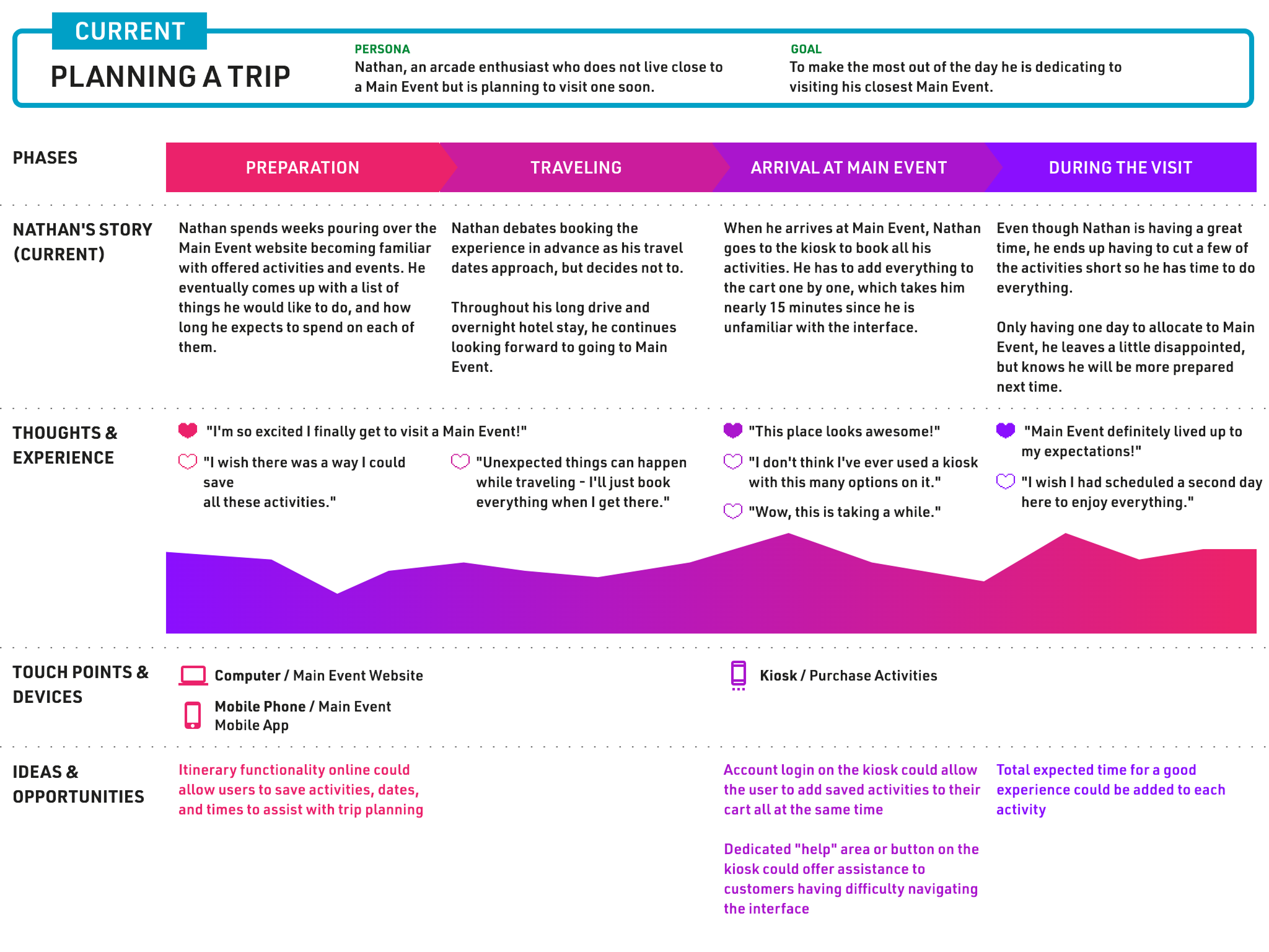
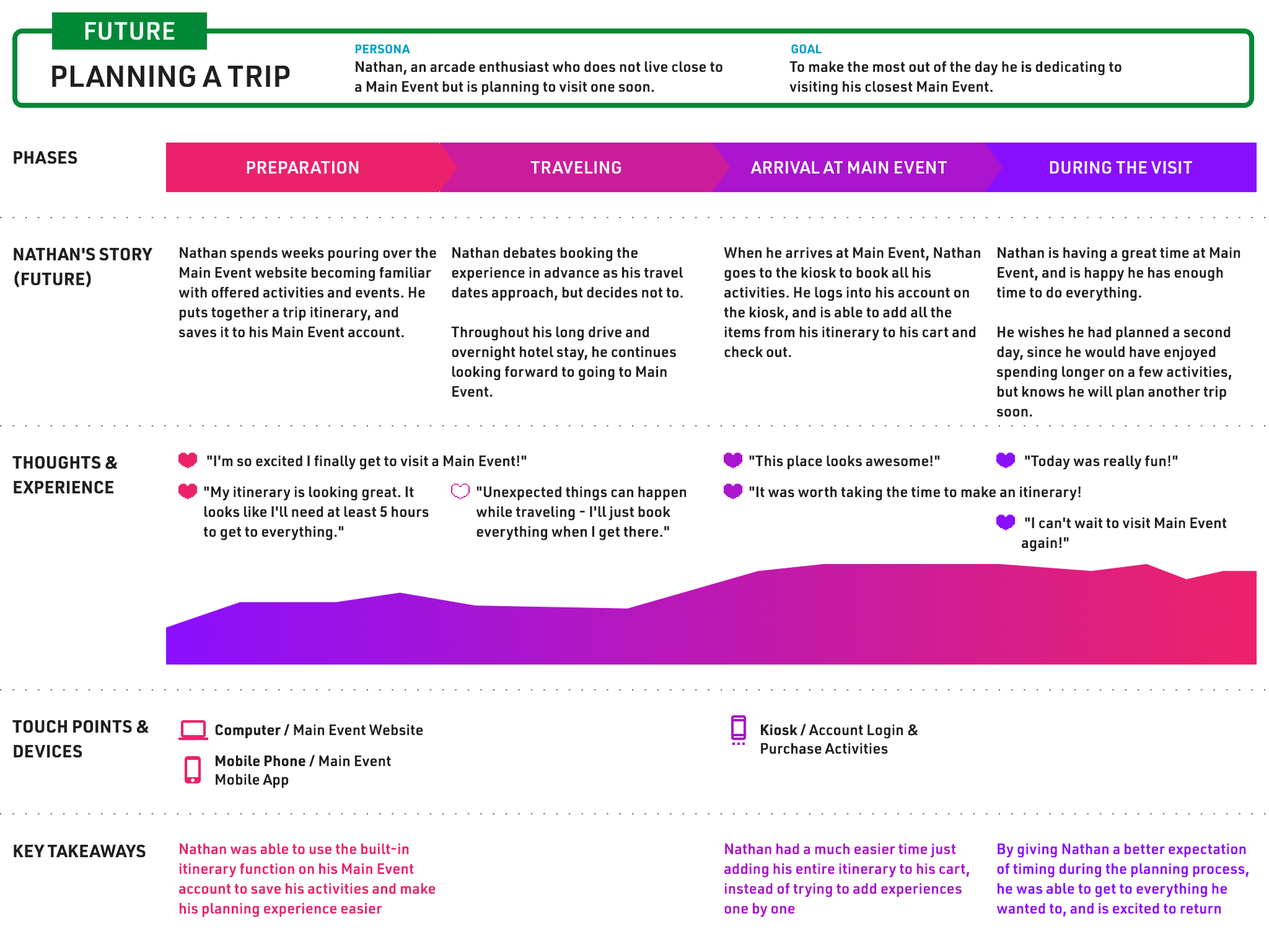
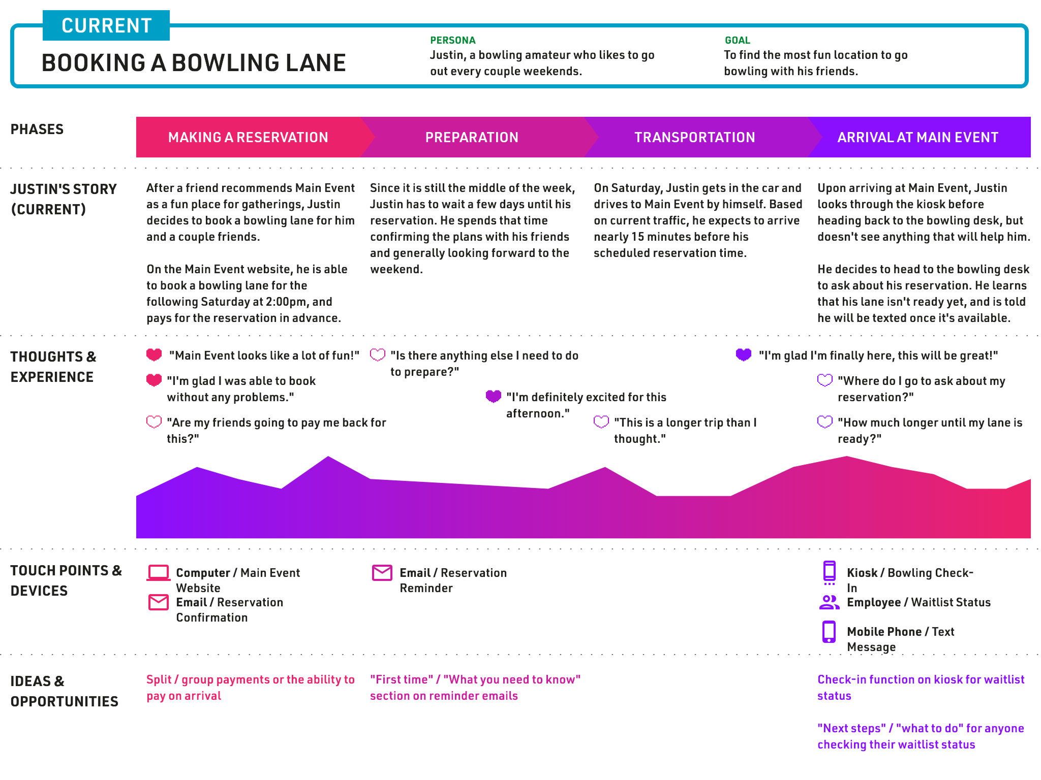
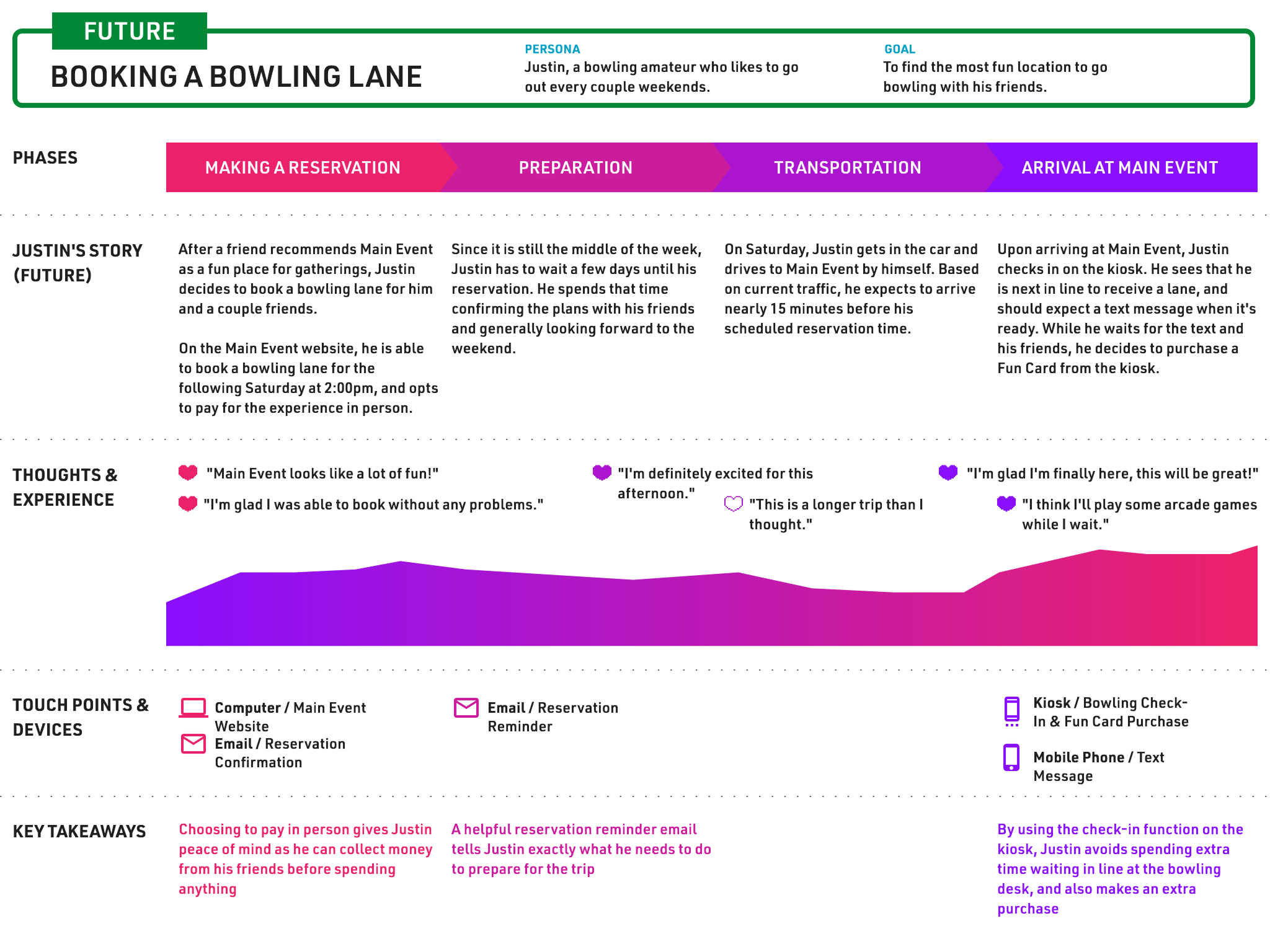
User Journeys
User Research
The first step in this project was to perform an evaluation of Main Event's current kiosk interface. Despite the original ask being to design screens for employees, I wanted to match the look and feel of the customer view for brand consistency. I also wanted the opportunity to show Main Event where they could improve their experience for customers, as they had gotten feedback that the (relatively new) kiosk system was clunky and not the easiest to use. From performing this evaluation and also by speaking with employees at various Main Event locations, I learned the following:
- It was somewhat common for kiosks to stop working in the middle of customer transactions, making employee involvement mandatory
- It was also common for users to not know how to proceed with booking events via the kiosk, and to seek out employee assistance instead
- Despite the kiosks being a "new and exciting" addition to their properites, Main Event locations were continually pushing online and mobile transactions as an alternative to their kiosks due to customer confusion with the activity selection process
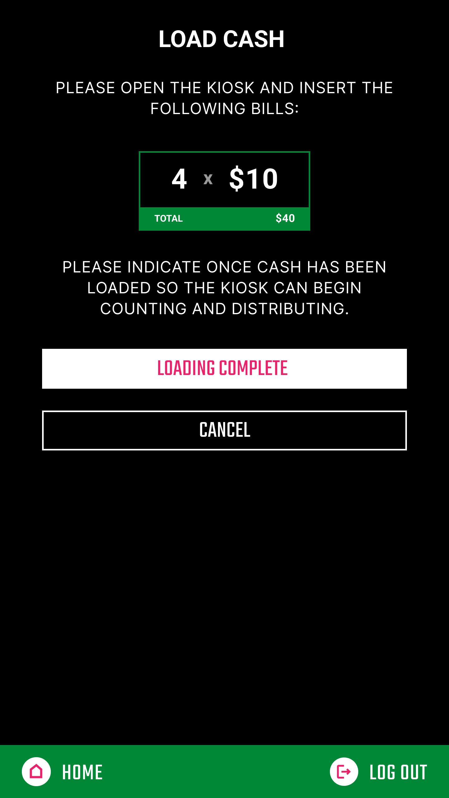
- Employees found themselves faced with hardware limitations of the kiosk during the cash loading process, such as bills jamming inside the machine and only certain numbers of bill types being allowed to be in the machine at one time, which were causing confusion without any matching UI
Design Process
Designs
Icons
UX/UI Design
Iconography
Adobe XD
With a statement of work signed for a limited number of customer-facing screens and the entirety of the admin portal side of the kiosk, I was able to start designing. The work was done in Adobe XD, and progress was shown to Main Event during weekly status calls.
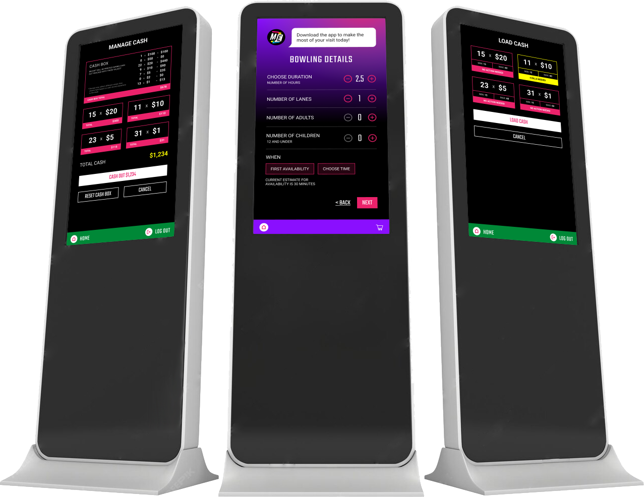
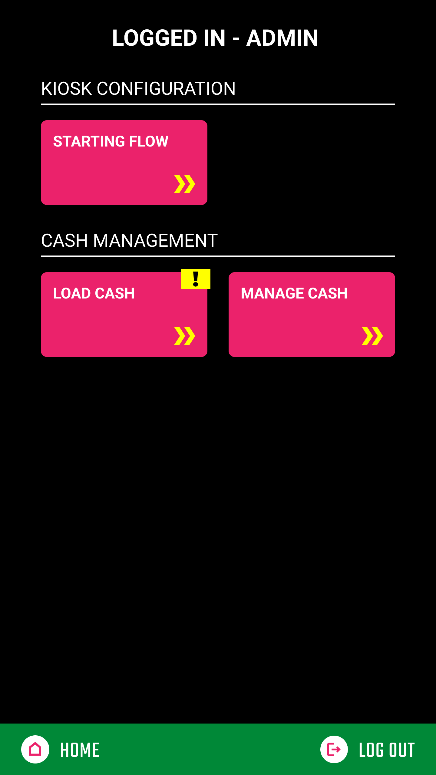
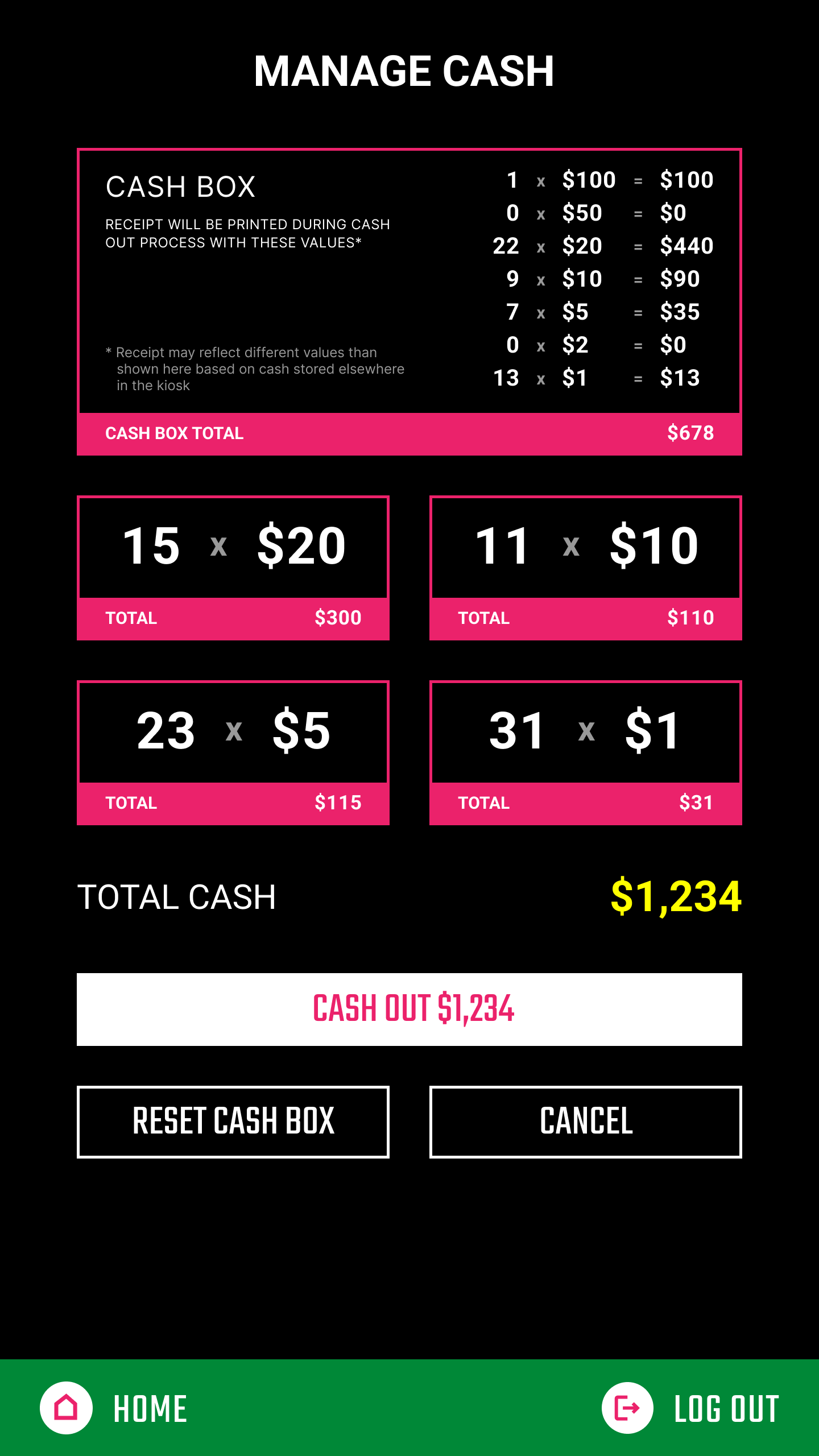
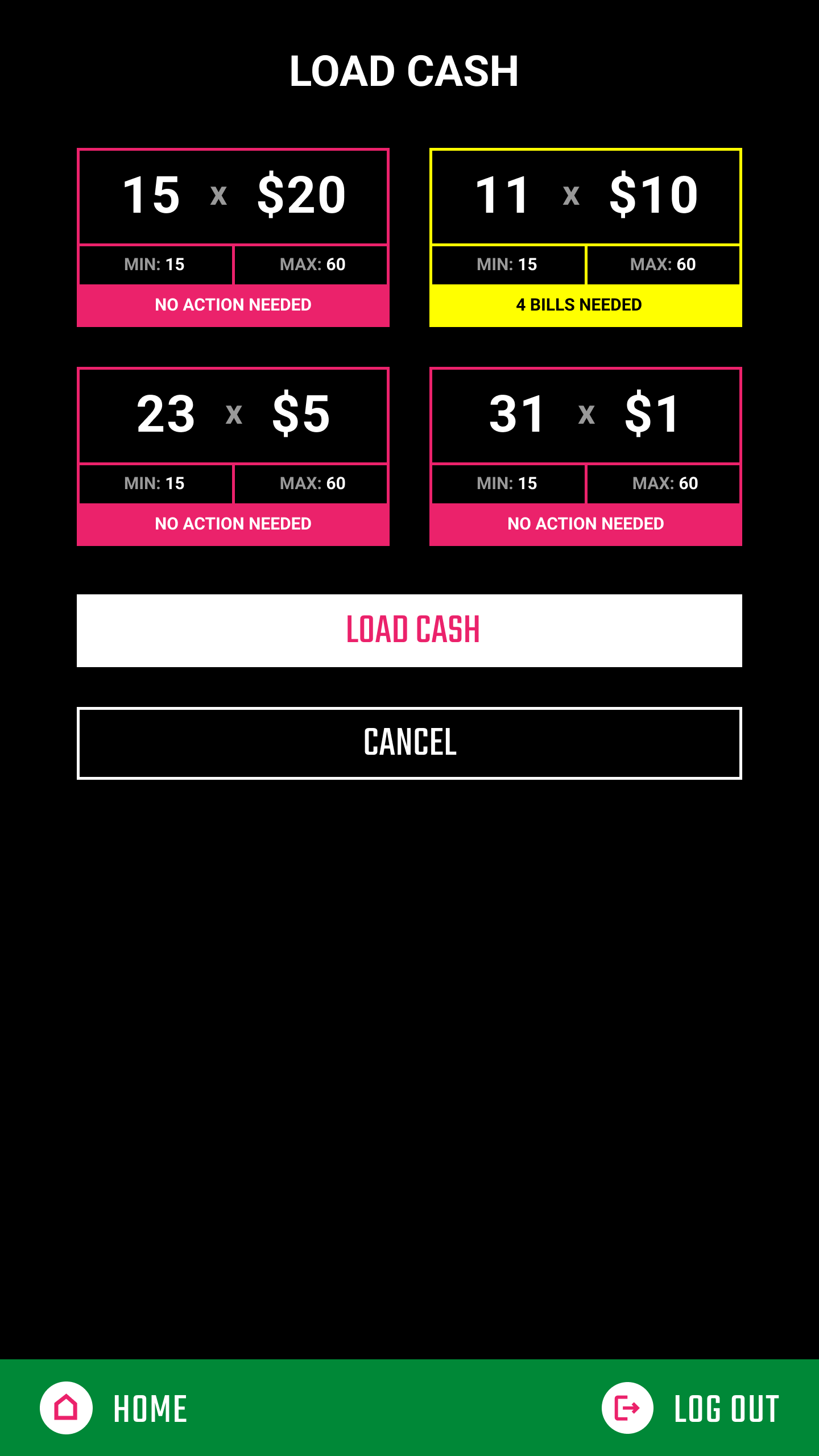
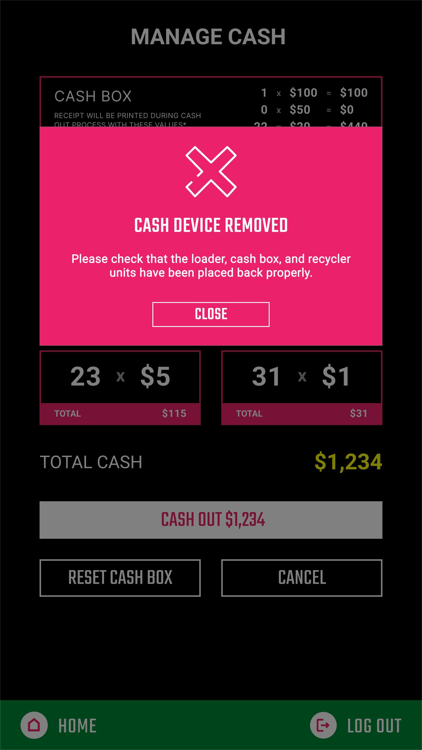
The main design was for the employee-facing experience, providing them with a platform where they could log in as a registered employee and manage cash that was kept in the machine. The box had strict requirements for the amount of money that could be kept inside it, with each monetary dollar value having a minimum number of bills needed for the machine to even operate as a payment option. With no UI, this meant employees were manually counting bills and tracking them both for taking out and putting in cash, so the main goal became ensuring that both the number of bills and total monetary value were displayed on the screen, helping employees to keep track of what actions they had already performed with the machine.
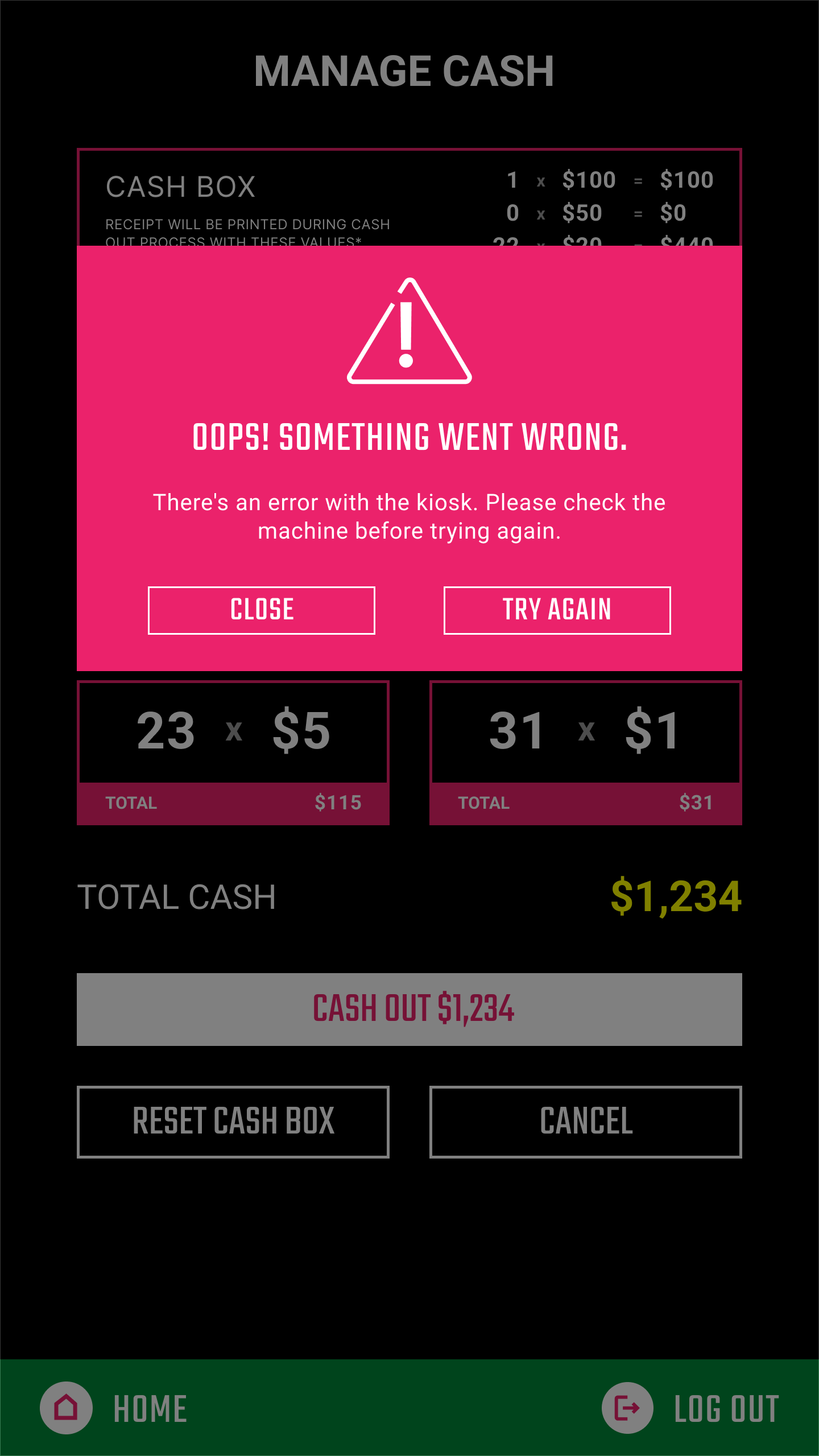
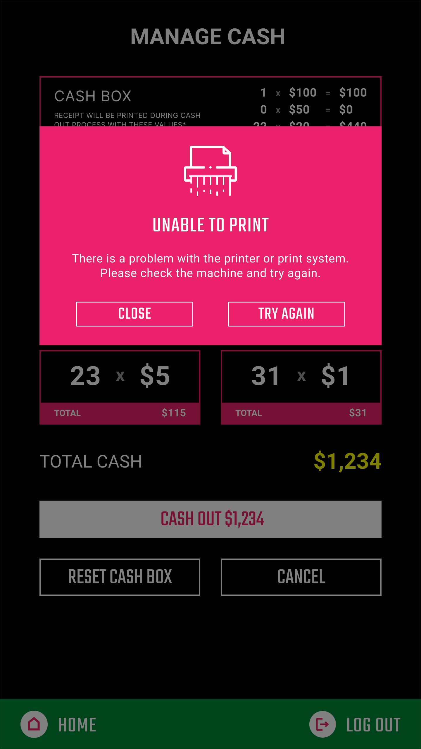
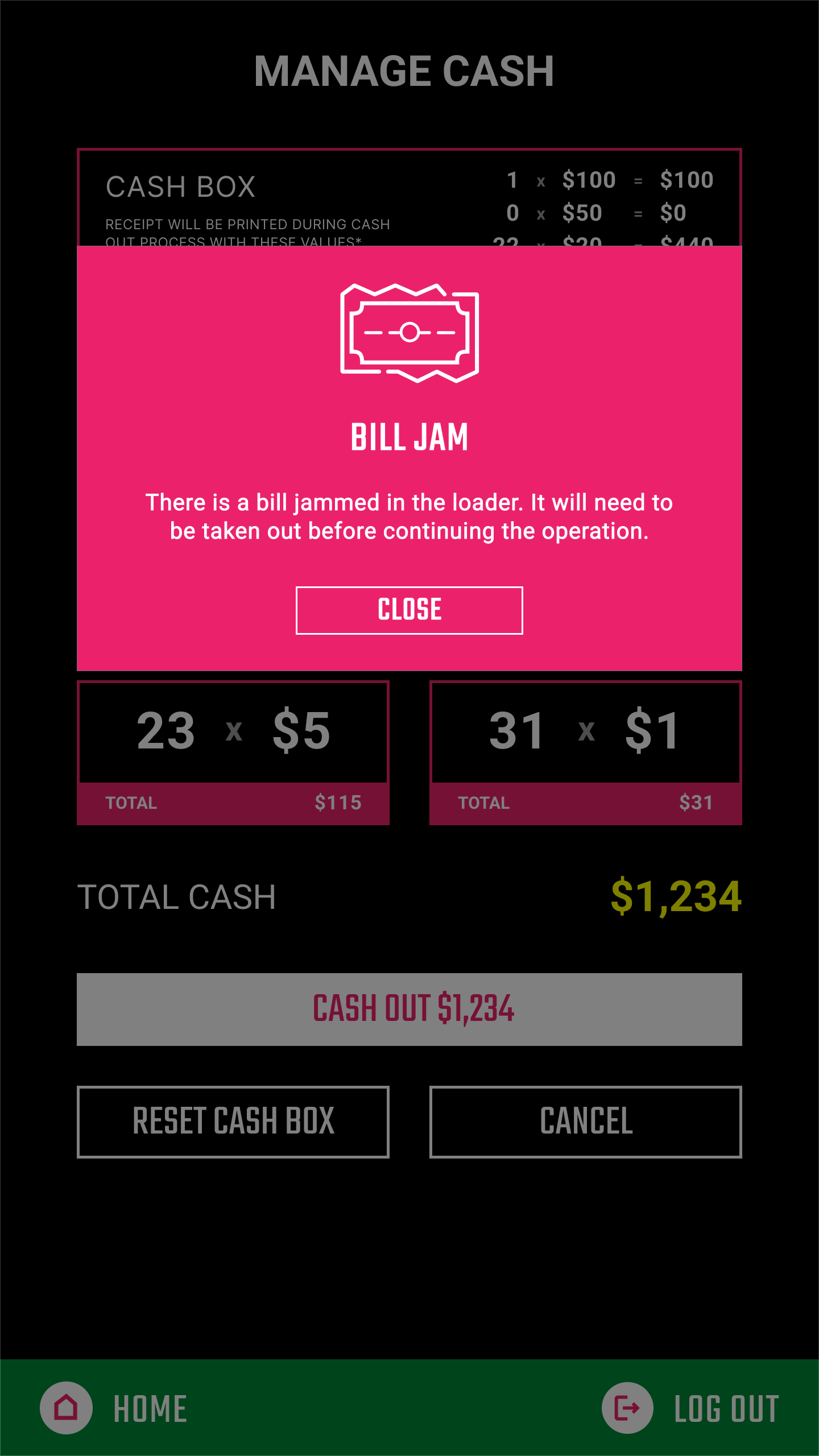
Unfortunately, employees faced more difficulties than just knowing how much cash they handled. Specifically when it came to the cash box, it was prone to frequent errors with bill jams and refusing to print receipts (which Main Event employees needed to prove they had performed a transaction) - and each of these needed a custom error message so employees were able to fix the issue. The creation of so many alerts and errors led to me making a custom limited icon set, made to match the thin, outlined style of the existing Main Event icons that can be seen on their website and kiosks.


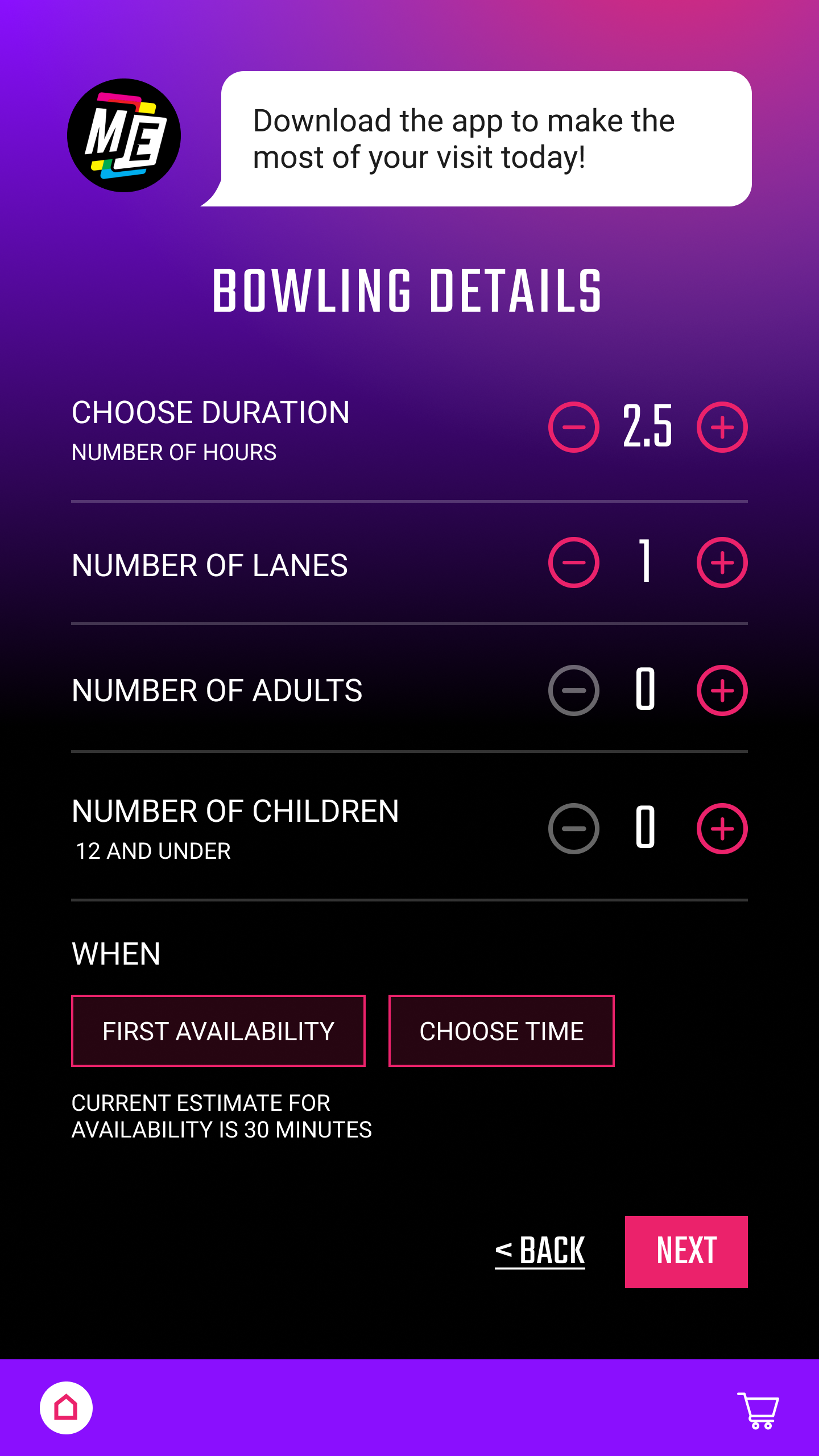
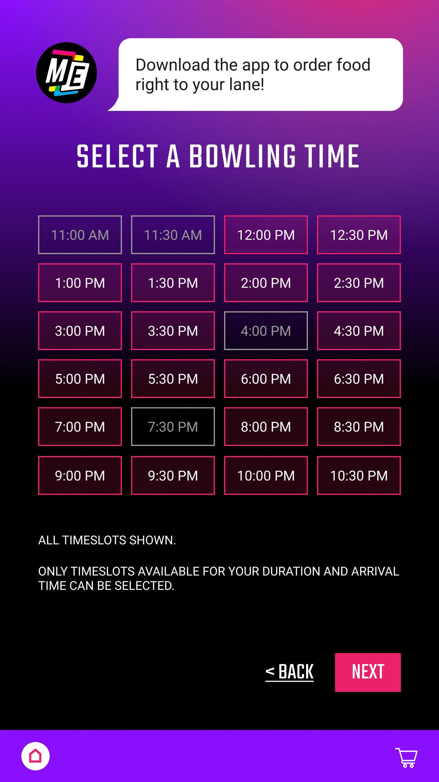
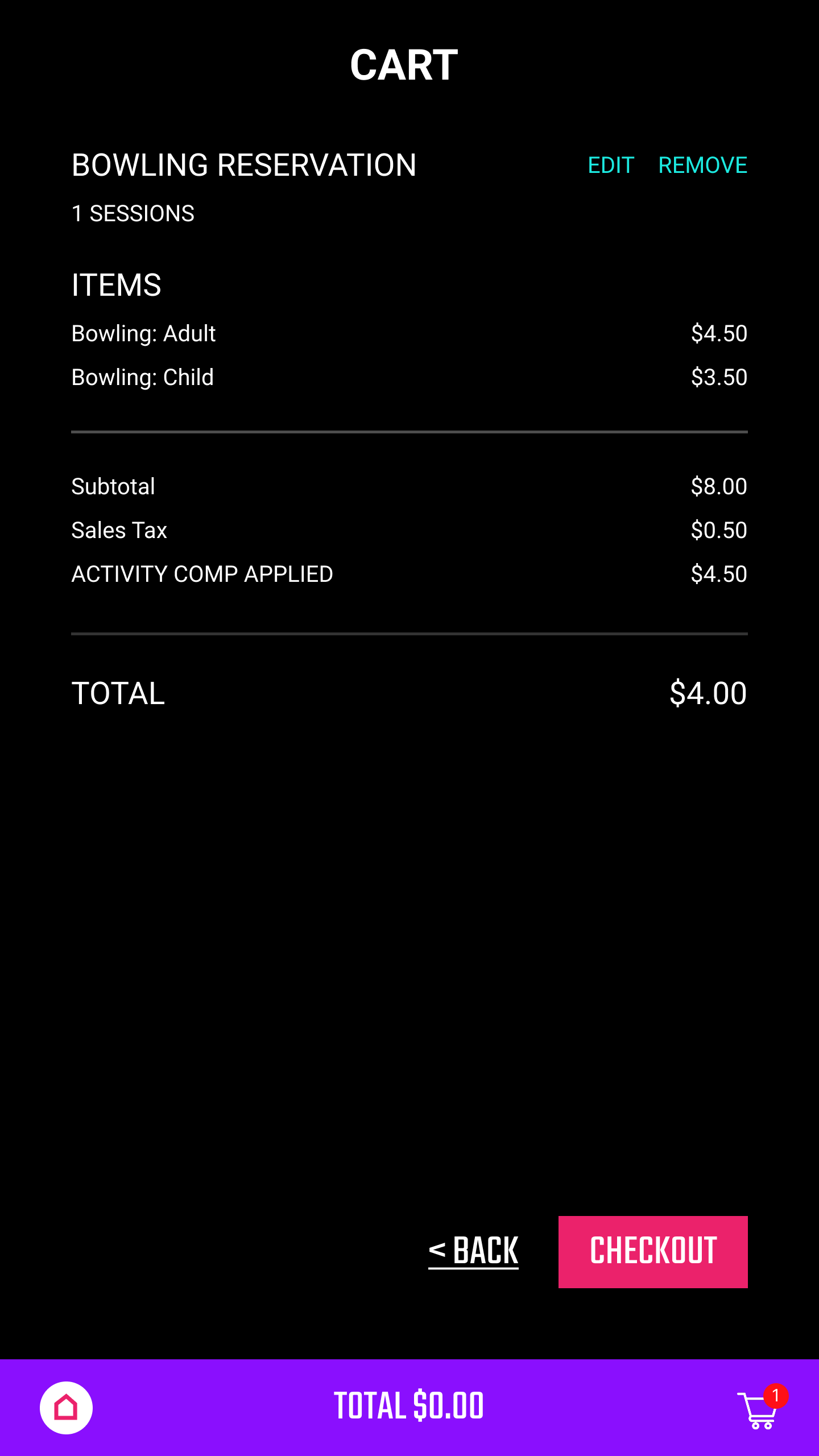
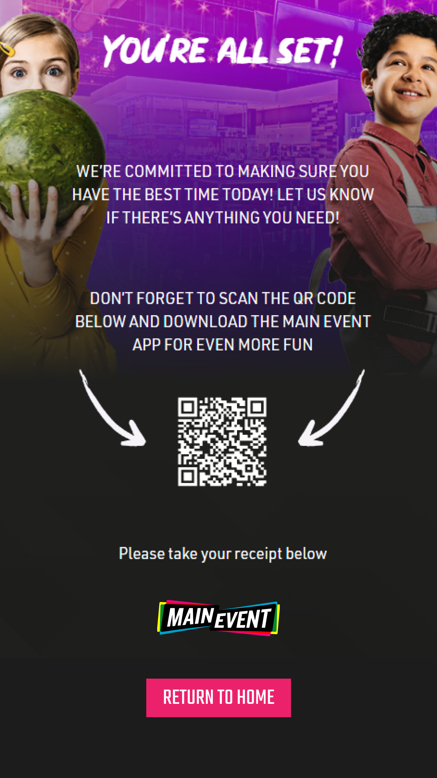
The customer-facing screens were done as an addition to this project once the employee screens had been fully tested and signed off on by Main Event, and included a few key processes such as bowling and gravity ropes reservations, and the checkout process with a focus on cash transactions to set up more informative messaging when the cash box did not have the required capacity. These screens were released at a single location for on-site user testing over a limited time, and only minor edits were needed in order to make the user experience better for both customers and employees.
Challenges
One of the big challenges when designing was lack of access to the platform. Kiosks have extraordinarily large screens and can be placed at an awkward height for some users, making it necessary to significantly scale up elements from what you would see on a desktop or mobile screen. Several test screens were made and uploaded to a kiosk by an employee so I could make sure I had the sizing and spacing right before proceeding with the final designs, which took a bit of trial and error.
The hardware limitations and frequency with which physical issues happen with kiosks also posed a challenge. No matter how good a user interface may be, the user experience will always be somewhat dependent on screen working, which didn't always happen. In order to help combat this, touchscreen elements were made rather large so that a user might be able to tap on a different part of the screen if something wasn't functioning, and more informative error messaging was added at various stages so both customers and employees would know what had gone wrong.
Outcome
Main Event employees were very happy with the new UI for the administrator screens, overall experiencing less frustration when going through the cash flow process and saving 30 minutes or more when performing daily kiosk management tasks. Additionally, they noted that they now knew their receipts were accurate, which helps to ensure proper reporting and supports compliance.
On the redesigned customer flows, employees saw an 8% increase in transactions completed on their kiosks over transactions completed through employee assistance. This data is from a handful of locations that had kiosks implemented.