Project Overview
Known Information
Because of my existing familiarity with animal shelters and adoption processes, I was already walking into this project with several pieces of information other people might not necessarily have had. This made me feel like I already knew some of the things that would need to be part of an online adoption flow, and helped to make my research and design both more targeted.
- People loved to see the animal happy or curious, but were reluctant to get to know an animal that appears scared
- Information cards on each cage or kennel usually state how well the animal gets along with other animals and with children
- Other information such as animal weight, grooming considerations, or pre-existing conditions were kept on file and could be provided upon request
- People interested in adopting an animal could ask to spend time with them outside their cage, either in a large cage or a separate room, and shelter staff often has to sign off on a match between person and pet prior to adoption
Research
User Personas
Competitive Audit
User Research
After speaking with potential users, I discovered that they tended to like to stay local for animal adoption, and so would be used the website of whichever animal shelter was closest to them if they went online. However, many preferred to look in person for a few reasons:
- It is difficult to get a real feel for the animal's personality online, as most animals are not given a description and only has one picture, taken when they first get there, in which they are often terrified
- They would strongly prefer to visit with a pet for a while before bringing them into their household, especially if they have other animals or younger children that they need to make sure would all get along
Knowing I would need to design a website that centered a lot around pet descriptions and non-traditional shelter images, I moved onto the competitive audit to see if there were any shelters doing that already. While I did find that some shelters were making movements towards better imagery and descriptions, I also found out that most shelter websites don't allow for online adoption processes - even just to fill out paperwork in advance or schedule a visit with a pet.
Check out Lauren's Persona
View Competitive Audit
Branding
Color Palette
Typography
Logo
Iconography
Figma
While some designers might choose to jump straight into wireframes or mockups, I decided to work on the branding first - mainly as my animal shelter didn't even have a name, and I wanted to design for one I created rather than just an existing shelter. I started with the phrase
"pets leave paw prints on our hearts", and from that, instantly knew I would be naming the shelter
Happy Hearts.
Because of the strong association with love and hearts, I decided that the main branding color would be pink - and to add a bit of extra warmth, I put it opposite orange. This also allowed for beautiful gradients to be added to the brand.
From here, I wanted to create the logo, and this ended up being very easy. Paw prints look a lot like hearts, and so I already knew I wanted to create a paw print heart. I created two different versions of this - one outlined, one filled - because when you first arrive at an animal shelter, your heart might be empty, but it will be full by the time you look at all the different animals you could welcome into your family.


Finally, I had to work on typography. For the wordmark and main header, I knew I wanted something light and happy, that would convey a sense of belonging. For this, I chose
Bellota. Then, for the main copy on the website, I chose
Roboto with the option to use
Roboto Condensed for important areas where Bellota would be difficult to read.
happy hearts
Design
Designs
UX/UI Design
Figma
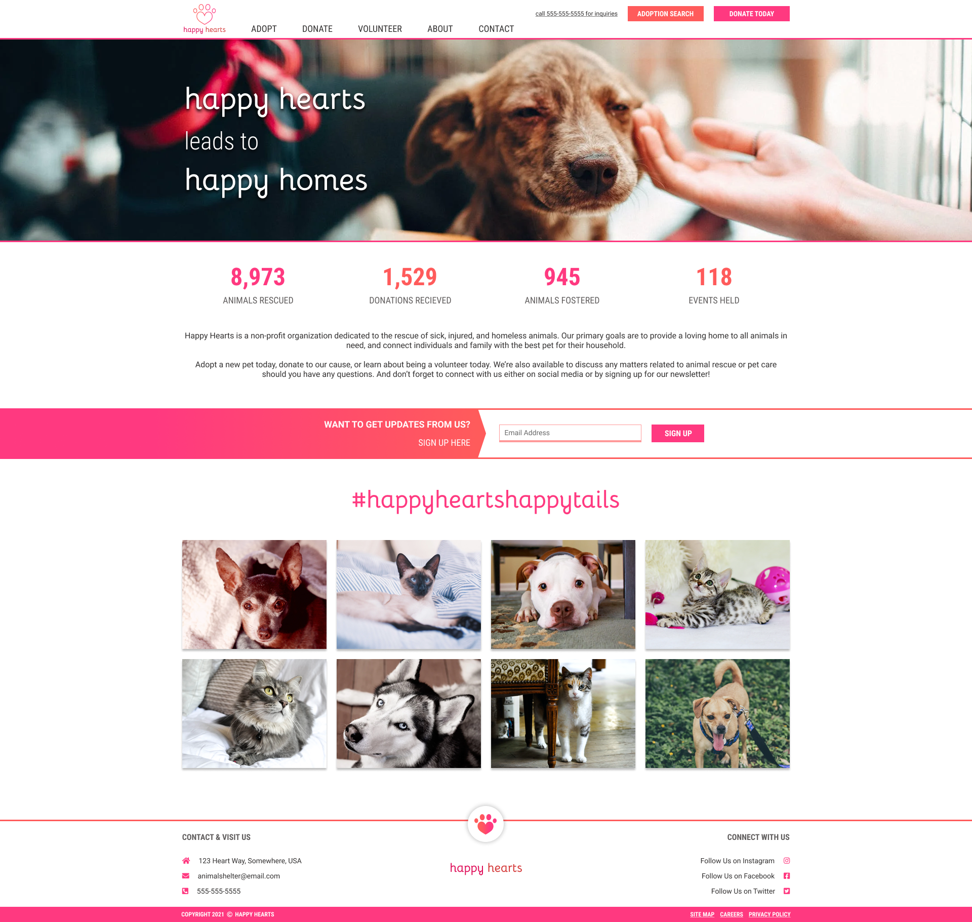
Moving into the design at last, I tried to make everything on the website stand out with intentional pops of color. Statistics of rescued animals line the top of the page, while happy adoption stories shared via hashtag take up most of the room on the page. Knowing that one of the biggest blockers to adoption is wondering if a pet would even be happy in your home, it felt important to showcase success stories.
The main navigation directs attention immediately to the adoption search, with a bright call-out that shows both on desktop and mobile without needing to open the menu first. Additionally, the first item on the menu is
Adopt, encouraging users to select that first.

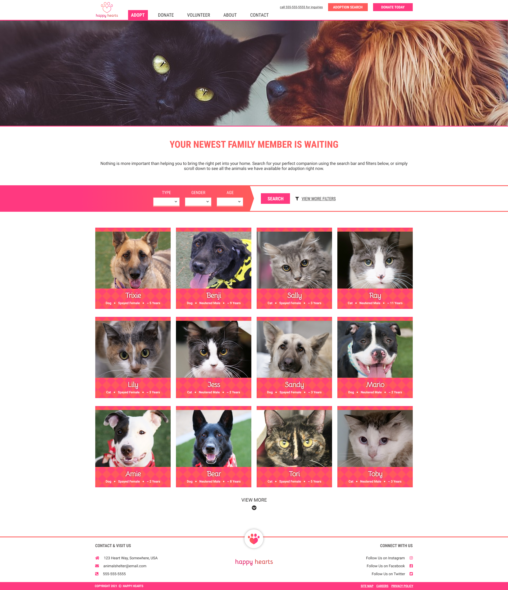
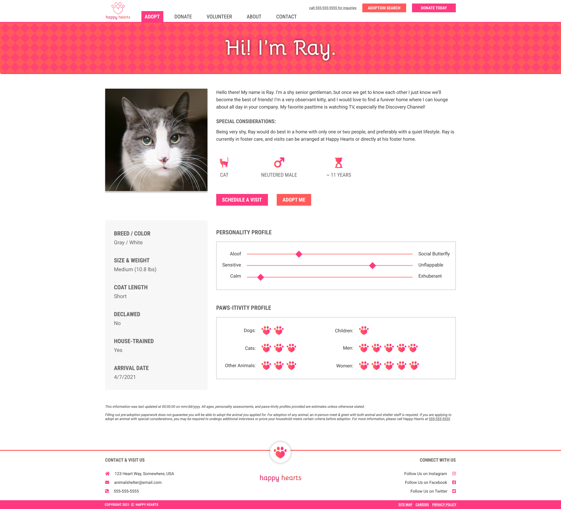
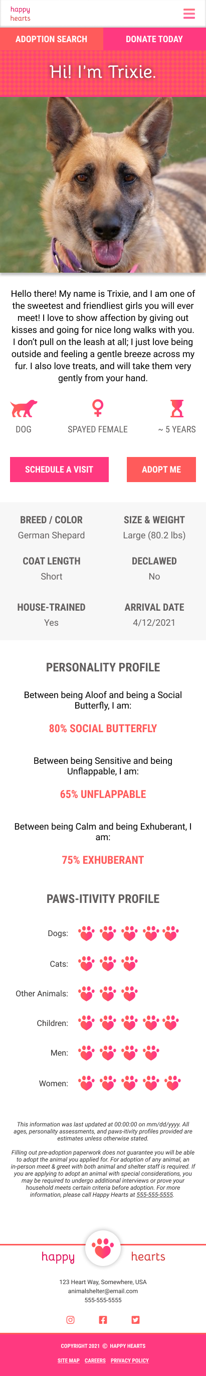
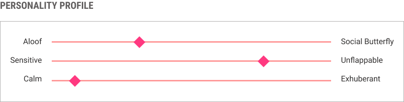
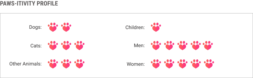
While the main adoption page lists out pets in a friendly, easy-to-see way, the real bread and butter of the design is in how the pet profiles are laid out. Traits such as pet personality and how well they get along with various other animals and people - things that normally result in failed adoptions if not properly communicated - are laid out front and center in short, easy-to-read widgets.
With these immediate indicators of whether a pet would be a good fit and a bright button that says
Adopt Me directly next to them, users are bound to click through to the adoption application if they see a pet that would be a good match!
Just a quick note for all you animal lovers out there - I am in no way recommending that pets should be adopted without meeting them first. The adoption paperwork is simply a preliminary submission of interest on this website, and a way for a person to submit their interest in a pet to speed up the process should they come to the shelter and decide to adopt.