Project Overview
Planning
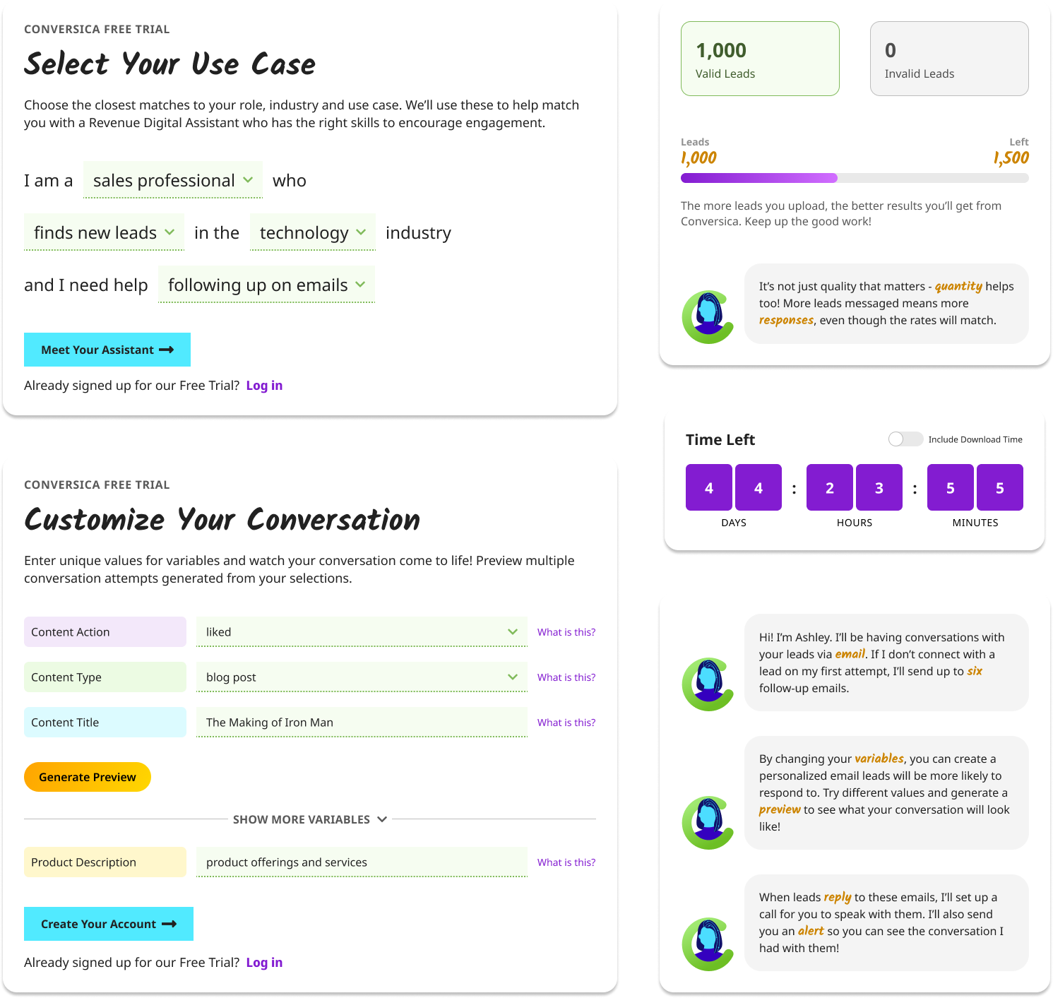
The planning phase for this project was unusually long, and involved a lot of meetings between UX, product, and marketing teams to narrow down the features that would be available to users. What we were mainly trying to figure out was, "what is the MVP of Conversica?" - and after several weeks, we came up with the following:
- Our customizable assistants (AI agents) that handle all communication with leads
- Our conversation variables, which have a large impact on the voice and tone of your messages
- Our lead management process, all the way from uploading your first lead to exporting data and reports from the entire length of the free trial
- Our engagement-focused dashboard, which gives users a snapshot of their performance with Conversica over the duration of their trial
Design
Mockups & Prototype
UX/UI Design
Figma
There were a lot of different iterations of this design created, not being sure whether we were launching this as an account snapshot on Conversica's website or a limited product experience. Finally, I decided to just mock up both experiences, and let our potential users decide for us on which one they would like the most.
There were still several business requirements that I had to meet in both versions of this process. A brief overview of both those requirements and the UX solutions I came up with for them are listed below.
| Business Requirement |
UX Solution |
| Give users a creative way to tell us their use case |
A conversational "form", with dropdowns at appropriate places for users to fill in the blanks |
| Allow users to see our variables before giving them access to the product |
Variable setup for conversation customization was included as part of the signup process - as an additional bonus, that meant the user's conversation would be set up and ready to go when they clicked on the signup button |
| Find out what quality of leads users were uploading to the free trial |
Added a lead quality selector to the lead uploader process, giving users several options to choose from and adjusted estimates of performance based on the lead quality |
Encourage users to share their free trial experience on social media |
Social sharing widgets on the dashboard, close enough to the timing widget for users to notice them |
User Testing
Usability Study
User Research
Usually within a B2B service like Conversica, the user pool to pick participants from comes solely from existing clients. But because this was for a free trial of our product, we needed to reach out to potential customers instead. This meant more dedicated user testing sessions done in a single round, and more importantly, extremely focused findings based on what we showed each participant. The most useful findings we discovered from these sessions were:
- Users find the flow to be friendly and our process to be compelling, plus the UX is intuitive
- They did not have a good understanding or what they might experience during the free trial before signing up
- Lead uploads correspond with product familiarity, with a completely unfamiliar user only wanting to upload 10 very cold leads to start with
- While individual folks in sales are interested in the free trial, they wouldn't sign up or upload leads without management's buy-in
- Users do not find conversation editing to be helpful within a limited mode - they were only interested in adjusting variables
Overall, and perhaps most importantly, users had the best reaction to the lead uploader that was hosted through the website. This (combined with what it would take to transition free trials to paid accounts) helped to shape our decision to move forward with the hybrid approach for development.
Challenges
The biggest challenge we ran into across the project was alignment. This free trial touched many different departments and spanned across two different development teams with the website and product being involved, and leadership also was keeping a close eye on it. Getting everyone onto the same page and agreeing on the right way to move forward was a struggle, and it took a lot of visuals and presentations to support UX's position throughout the project.
Another challenge was that one of the business requirements simply could not be met. The business set up the free trial specifically so that users would share the experience on social media - yet no matter how social sharing was presented to users, they all said this is not the kind of thing they would ever post about or advertise. What would it take for them to share? Being a paid customer that loves the product, a level of trust that a free trial user is very unlikely to have. It was clear we were marketing sharing towards the wrong target audience, and no amount social icons was going to change that.
Outcome
This project became one of the most thoughtfully crafted experiences I've designed for Conversica. The final solution we settled on brought clarity to our signup process overall, and our stakeholders were genuinely excited by how intuitive and beautiful the design was - they felt like the design raised the bar for what's possible, and changed the standard of usability we would be able to deliver to our customers. While the external market impact never reached the level that our team had hoped for, it did spark some new internal conversations about elevating UX across the product, and to me that still counts as a win.

